In this tutorial, we're going to design and code our first website in simple, easy steps. This tutorial was written for the beginner with the hope that it will give you the tools to write your own standards-compliant websites!
If you're looking for a quick way to get started, look through our collection of website templates for a professional, responsive option that is ready to customize to your next project.
Learn CSS: The Complete Guide
We've built a complete guide to help you learn CSS, whether you're just getting started with the basics or you want to explore more advanced CSS.
Otherwise, it's a brand new week; maybe it's time to learn a new skill!
Step 1 - What We're Making
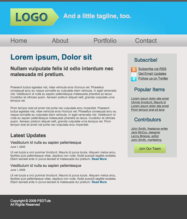
We're going to design and code this very simple website. Spectacular design, it's not, but it'll be very effective for teaching basic coding techniques.
Step 2 - Getting Ready
What you need
This tutorial was written assuming that you've never coded a website before, or have only done it a few times. Nevertheless, to complete this tutorial, you will need the following:
- Photoshop or a similar image editor
- A code editor (more on that later)
- Basic understanding of how html works, basic syntax and tags. To get up to speed, check out the official resource at w3 Schools, where you can learn all the basics needed for this tutorial.
- Ditto for css, you should understand how selectors work and be familiar with basic properties. Again, the best resource here is w3 Schools
- A browser, obviously. I'm using Firefox, and if you want your site to look just like my screenshots in each step, you should too
Layout
We're making a very simple website here, with four basic elements: header, content, sidebar and footer, the layout is going to look something like this:

It's a good idea to block out the layout of your design before you start, either on paper or in Photoshop, to streamline your workflow and organize your ideas.
Step 3 - Getting Started
Open up a shiny, new Photoshop document, say, 1000px by 1200px. We can always crop it later. I'm making it pretty narrow because I'm working on a laptop here, but feel free to go wider if you like more space to work.
Now, I'm not going to go into the debate about screen resolutions and optimal website width here. All you need to know is that the content of our page is going to be 800px wide, and that that's okay. So, on our 1000px wide document, we're going to drag in guides at the 100 and 900px marks to set the width. Our design has a sidebar, and I've decided to make it one third the width of the page. Two thirds of 800 is about 530, so let's put in one more guide at 630px. We'll also set a nice background color of #ebe8e8.

Step 4 - Header
Grab the rectangle tool and draw a big, blue box at the top of the document, mine is about 170px high and the color is #23b6eb. Next draw a skinny, dark grey bar at the very top of the page, I used #5d5a5a

Step 5 - Highlight
Now we're going to add a bit of a lighting effect on the blue header area. Create a clipping mask above the blue layer, then Grab a big, soft brush (400px wide) and pick a color a bit lighter than the blue background.
Now lightly click the tip of the brush right below the bar, around the centre of the document. Keep it subtle, and try not to let the lighter color reach the edges of the page (this will be clear later). And set the blending mode to screen.

Step 6 - Navigation Bar
Now we're going to add another bar to the bottom of the blue one, we can make it grey, but we're going to add a gradient overlay so it doesn't really matter.
In the layer styles panel, add a gradient from #e2e3e4 to #bebdbd at 90degrees.

Step 7 - Footer
Next, let's draw a grey box at the bottom of the page, I picked a color a bit darker than the grey from the bar at the top.

Step 8 - Logo
Background
For the logo, we're going to draw a rectangle and add another anchor point at the end, then drag it out to the side. To get rid of the rounding, option-click on the point.

Next, add some layer styles: a gradient overlay and a 1px stroke: Gradient from #aec457 to # cdf399


Text
Now for the text: big and bold.
- Font: Myriad Pro
- Style: Bold
- Size: 60px
- Color: #36809a
To give it some depth, add an inner shadow:


Step 9 - Tagline
Next I just added in a short tagline:
- Font: Arial
- Style: Bold
- Size: 30pt
- Color: #e4dfdf

Step 10 - Navigation
Write in the navigation links nice and big, spread them out and space them about evenly.
- Font: Arial
- Style: Bold
- Size: 30pt
- Color: #676666

Step 11 - Main Content
Time to paste in some dummy content. I used one bit header, which will be h2 and the smaller one will be h3 link to html ipsum.
Make the text boxes about The width of the first 2 thirds of the page. Text styles:
h2 Header:
- Font: Arial
- Style: Bold
- Size: 36pt
- Color: #0e5d7a
h3 Header:
- Font: Arial
- Style: Bold
- Size: 24pt
- Color: #444444
Paragraph:
- Font: Arial
- Style: Normal
- Size: 14pt
- Color: #595858

The dates under "latest updates" are going to be wrapped in a small tag, the font is the same as the paragraph, but 12pt. I copied the news item twice, cause I'm lazy.

Step 12 - Sidebar
Links
Next draw a skinny rectangle over our sidebar region, color #d4d6d3, with a 1 px stroke of #bebdbd
Fill up the sidebar with some more dummy content, you can get the free icons I used here. The fonts are:
h3 Headers:
- Font: Arial
- Style: Normal
- Size: 24pt
- Color: #044055
List items:
- Font: Arial
- Style: Normal
- Size: 18/14pt
- Color: #373737

Button
Next we're going to add a "join our team" button beneath the contributors links. The button is just a rectangle with the same gradient as the logo, and a 1px stroke color c7c7c7. The text is:
- Font: Arial
- Style: Normal
- Size: 24pt
- Color: #434343

Step 13 - Footer
To finish off the mockup, just add a bit of dummy copyright text, or whatever you want, to the footer. The font is:
- Font: Arial
- Style: Normal
- Size: 14pt
- Color: #e0e2e2

And that's it for the page design, it's nothing special, but its simplicity will make it easier for you to follow the rest of the process.
Slicing the PSD
Now that we have our lovely completed psd, it's time to chop it up into pieces we can use. The idea here is to use as few images as possible, and to make them as small as possible. Okay, so let's start with the header. We want it to stretch out across the whole screen, no matter how wide it is. To do that, we're going to grab a tiny little sliver of the header, and have it repeat across the screen again and again, no matter how wide.
Step 14 - The Slice Tool
Now you probably haven't had to use the slice tool before, but it's really very simple. It just lets you slice your file into teeny tiny pieces which can be exported for the web.
Header
So, let's go ahead and grab a little slice of our header. Click and drag to create the slice, just like the rectangular marquee tool. Be careful to take the slice from the side of the image, so you don't get any of the highlight.

Now that we have this little stripe, we can repeat it along the x-axis. The highlighted area, however, is non-repeating, so we have to cut out the whole thing. Slice the section of the header between the two guides that denote our 800px width.

Footer
We use the exact same process for slicing the footer, grab a skinny piece of the footer.

Everything Else
We just need a couple more images: the "subscribe" icons and the "join our team" button.
Because the icons and the logo are irregularly shaped, we're going to save them as transparent .png files, so we're going to come back and grab them separately.
Okay, so to slice the button, we can use the same technique as the header and footer, but this time we only need the one thin slice. When you make the slice, be sure to not include the 1px stroke, (we're going to add that in later) you might need to zoom in really close for this.

Step 15 - Export for the Web
Now that we have our images all sliced up, let's save them as optimized jpegs and put them someplace useful.
Go to File/Save for web and devices... In the popup window, hold down shift and click to select each of the slices (again, you might want to zoom in) Check that the "preset" drop-down menu is set to JPEG-High, uncheck the "convert to srgb" and click "save"

In the next window that pops up, pick a name and location for your images, I'm just going to save to the desktop for now.
Make sure it's set to "images only", "default settings", and "selected slices only."

Next, check out the location you saved your files to. Instead of seeing the individual images, you'll just find a folder labeled "images" where all your pictures are located. The computer will give each image a number, which isn't very useful. Check that you have the right images, then name them appropriately.
Now, back to those pesky icons and the logo. Be sure to hide all the background layers, then take out the slice tool again and cut out nice little boxes around each icon and the logo.


Now we go through the same process of exporting for the web as we did with the jpegs, only this time be sure to select PNG-24 from the "preset" dropdown menu, and that the "transparency" box is checkmarked. Rename these files too, and your images folder should look something like this:

Alright, that's it, we're done cutting up our psd, and we have all the images we need. Don't close Photoshop just yet, though, we'll still need to pick out colors, fonts, dimensions, etc.
Part 3 - HTML
Step 16 - Getting Started
Alright, time to dive into some html. The first thing you're going to need is a code editor of some kind. This is often an area of personal preference,
but I recommend starting off with a free one. For mac and PC, I highly recommend Komodo edit as a first code editor. It has a lot of features that are ideal for beginners and advanced users.
One of the best features is the syntax-checker, which is like the spell-check in word processors, which will identify and explain little mistakes.
For PC, there are a lot more options, none of which I'm very familiar with, but check out Andrew Burgess' article 22 Neat Code Editors for Windows
In this tutorial, we're going to use Komodo edit, but the principles are the same in every editor.
Step 17 - Setting up our Folders
First things first, we need to set up a place to hold all the files related to our site. Create a folder for your website, mine is called "MySite", inside this folder, create another folder containing the images we just sliced.
Name this folder "images". Now we open up our code editor, this part will be a bit different depending on what software you're using:
If you're following along in Komodo, select "create new project" and save/move the .kpf file to the "MySite" folder. When you open up the file, the file browser at the side of Komodo should display the contents of the folder.
Next right-click on the project file, and scroll to "add" and select "new file". In the window that pops up, select "html(xhtml)" and name the file "index.html".


If you're using another editor, the process should be similar, but the essentials are the same: you need to create an index.html file, and it needs to be in the "MySite" folder along with the images folder.
Step 18 - Setting up our index.html File
The first thing we need to do is declare the doc type, character encoding, and create the <html> tags. Many editors will do this for you, but if not, it should look something like this:
1 2 3 4 | <?xml version="1.0" encoding="UTF-8"?><!DOCTYPE html PUBLIC "-//W3C//DTD XHTML 1.0 Strict//EN" "http://www.w3.org/TR/xhtml1/DTD/xhtml1-strict.dtd"></html> |
between the html tags, we need a "head" section, which contains all sorts of important information about the site which isn't displayed within the body of the site.
For us, at this point all it's going to contain is the title of the page, like this:
1 2 3 | <head> <title>MySite</title></head> |
below the head, logically, we add the body, also contained within the <html> tags. Okay, so far we have:
01 02 03 04 05 06 07 08 09 10 | <?xml version="1.0" encoding="UTF-8"?><!DOCTYPE html PUBLIC "-//W3C//DTD XHTML 1.0 Strict//EN" "http://www.w3.org/TR/xhtml1/DTD/xhtml1-strict.dtd"> <head> <title>MySite</title> </head> <body> <!-- content goes here --> </body></html> |
This is a basic page setup, you might want to save this clip somewhere for future use.
So remember when we said we'd have header, content, sidebar, and footer sections?
Good, now each of these is going to be within its own <div>, and will be given an appropriate id.
01 02 03 04 05 06 07 08 09 10 11 12 13 14 | <body> <div id="header"> </div><!--end header --> <div id="content"> </div><!--end content--> <div id="sidebar"> </div><!--end sidebar--> <div id="footer"> </div><!--end footer--> </body> |
NOTE: it's a good idea, especially when you first start, to add comments at every </div> so you can keep track of the hierarchy of divs.
Now let's take another look at our psd - remember how we want the footer and header slices to repeat indefinitely out to the sides?
We're going to need a way to let these elements stretch out, but at the same time, we need the main content ("content" "sidebar")
to be contained within a specified width at the centre of the screen.
To handle this, we need a big div holding our expanding elements, and a div to contain the main content.
We should also notice that the footer text is centered too, so we need to repeat the same process for the footer.
To do this, we need to wrap some divs around the ones we already have. We have two basic sections, the main section, and the footer section.
Each is going to be contained within one big, unruly div with an unspecified width,
and the content of each will be wrapped in individual divs that specify width and centering.
We want to use the same rules for the main and footer content, so instead of (or in addition to) specific id's, they will have specified classes,
which means you can create a set of rules to define all div's with the same class.
So the main content is going to be wrapped inside a div with the id "main" and our footer will be wrapped in a div with the id "footer." If it helps to visualize the structure, here's a diagram:

And the markup looks like this:
01 02 03 04 05 06 07 08 09 10 11 12 13 14 15 16 17 | <body> <div id="main"> <div id="header"> </div><!--end header --> <div id="content"> </div><!--end content--> <div id="sidebar"> </div><!--end sidebar--> </div><!--end main--> <div id="footer"> </div><!--end footer--> </body> |
Now we wrap each section in a containing div, with the class of "container."
01 02 03 04 05 06 07 08 09 10 11 12 13 14 15 16 17 18 | <div id="main"> <div class="container"> <div id="header"> </div><!--end header --> <div id="content"> </div><!--end content--> <div id="sidebar"> </div><!--end sidebar--> </div><!--end main container--></div><!--end main--> <div id="footer"> <div class="container"> </div><!--end footer container--></div><!--end footer--> |
I know all these wrapping divs seem redundant, but they will become relevant when we start styling the page.
Step 19 - Adding Content
Now that the structure of our page is set, we can start adding content, from top to bottom. Here's an outline of the html elements that will make up our page:

Header
At the very top we have our header, and within the header we have 3 main elements: a logo, a tagline, and a navigation menu.
So let's create a div for our header, and to keep things clean, we'll put the logo and tagline in their own divs.
1 2 3 4 5 6 | <div id="header"> <div id="logo"> </div> <div id="tagline"> </div></div><!--end header --> |
Because it's the most important heading of the page, the Logo is going inside an <h1> tag. We have more options for the tagline, depending on how relevant it is to your site. In this case, I'm using an <h3> tag.
For the navigation, standard practice is to place menu items within an unordered list, with each list item containing an anchor tag.
So we have:
01 02 03 04 05 06 07 08 09 10 11 12 13 14 | <div id="header"> <div id="logo"> <h1>Logo</h1> </div> <div id="tagline"> <h3>And a little tagline, too.</h3> </div> <ul id="menu"> <li><a href="#">Home</a></li> <li><a href="#">About</a></li> <li><a href="#">Portfolio</a></li> <li><a href="#">Contact</a></li> </ul></div><!--end header --> |
NOTE: the "href" value in the anchor tags would normally specify where the link goes, but in this case, the pound symbol just means "link to top of page."
Main content
Looking at our main content area, we have 4 different styles of type: a big heading at the top, a smaller one,
and an even smaller one heading for the news item titles, plus some paragraphs, and the small little dates on news items.
We're going to call these <h2>, <h3>,<h4>, <p>, and <small>, respectively. Now it's just a matter of pasting in your content, which isn't much fun, but it is pretty easy.
01 02 03 04 05 06 07 08 09 10 11 12 13 14 15 16 17 18 19 20 21 22 23 24 25 | <div id="content"> <h2>Lorem ipsum, Dolor sit</h2> <h3>Nullam vulputate felis id odio interdum nec malesuada mi pretium. </h3> <p>Praesent luctus egestas nisl, vitae vehicula eros rhoncus vel. Phasellus consequat arcu eu neque convallis eu vulputate diam vehicula. In eget venenatis nisl. Vestibulum id nulla eu sapien pellentesque malesuada pharetra ac lacus. Curabitur et ultricies quam. Aenean pretium aliquet velit, gravida vulputate urna tempus vel. </p> <p>Proin tempor erat sit amet nisl porta nec vulputate arcu imperdiet. Praesent luctus egestas nisl, vitae vehicula eros rhoncus vel. Phasellus consequat arcu eu neque convallis eu vulputate diam vehicula. In eget venenatis nisl. Vestibulum id nulla eu sapien pellentesque malesuada pharetra ac lacus. Curabitur et ultricies quam. Aenean pretium aliquet velit, gravida vulputate urna tempus vel. Proin tempor erat sit amet nisl porta nec vulputate arcu imperdiet. </p> <div id="news"> <h3>Latest Updates</h3> <h4>Vestibulum id nulla eu sapien pellentesque</h4> <small>June 1, 2009</small> <p>Ut vel turpis a orci pulvinar tincidunt. Mauris id purus turpis. Aliquam metus arcu, facilisis quis pellentesque vitae, dapibus non nulla. Nulla suscipit sagittis sodales. Etiam laoreet ante in purus laoreet id malesuada dui pretium.<a href="#"> Read More</a></p> <h4>Vestibulum id nulla eu sapien pellentesque</h4> <small>June 1, 2009</small> <p>Ut vel turpis a orci pulvinar tincidunt. Mauris id purus turpis. Aliquam metus arcu, facilisis quis pellentesque vitae, dapibus non nulla. Nulla suscipit sagittis sodales. Etiam laoreet ante in purus laoreet id malesuada dui pretium.<a href="#"> Read More</a></p> </div><!--end news--></div><!--end content--> |
I've added anchor tags with the value "Read More" at the end of each news item.
Sidebar
On to the sidebar now. The sidebar has three elements, each of which will be wrapped in its own div.
Each div will contain an <h3> header, and an unordered list, and each list item will again contain an anchor tag.
So go ahead and copy and paste your text in, and it should look something like this:
01 02 03 04 05 06 07 08 09 10 11 12 13 14 15 16 17 18 19 20 21 22 23 24 25 26 27 28 29 | <div id="sidebar"> <div id="subscribe"> <h3>Subscribe!</h3> <ul> <li><a href="#">Subscribe via RSS</a></li> <li><a href="#">Get Email Updates</a></li> <li><a href="#">Follow us on Twitter</a></li> </ul> </div> <div id="popular"> <h3>Popular Items</h3> <ul> <li><a href="#">Lorem ipsum dolor site amet</a></li> <li><a href="#">Ulvinar tincidunt, Mauris id</a></li> <li><a href="#">Lorem ipsum dolor site amet</a></li> <li><a href="#">Proin tempor erat sit tene</a></li> </ul> </div> <div id="contributors"> <h3>Contributors</h3> <ul> <li><a href="#">John Smith, freelance writer</a></li> <li><a href="#">Jack McCoy, designer</a></li> <li><a href="#">Lenny Briscoe, editor</a></li> <li><a href="#">John Smith, martketing</a></li> </ul> <a href="#">Join Our Team</a> </div> </div><!--end sidebar--> |
Footer
We may as well put the footer in before checking it in the browser, it should only take a second.
Worth noting is that any symbols you want to use in your text have special codes in html, for example, the copyright symbol is coded as ©
1 2 3 4 5 6 | <div id="footer"> <div class="container"> <p>Copyright © 2009 MySite <br /> All Rights Reserved</p> </div><!--end footer container--> </div><!--end footer-->In this tutorial, we're going to design and code our first website in simple, easy steps. This tutorial was written for the beginner with the hope that it will give you the tools to write your own standards-compliant websites! If you're looking for a quick way to get started, look through our collection of website templates for a professional, responsive option that is ready to customize to your next project. Learn CSS: The Complete GuideWe've built a complete guide to help you learn CSS, whether you're just getting started with the basics or you want to explore more advanced CSS. Otherwise, it's a brand new week; maybe it's time to learn a new skill! Step 1 - What We're MakingWe're going to design and code this very simple website. Spectacular design, it's not, but it'll be very effective for teaching basic coding techniques. Step 2 - Getting ReadyWhat you needThis tutorial was written assuming that you've never coded a website before, or have only done it a few times. Nevertheless, to complete this tutorial, you will need the following:
LayoutWe're making a very simple website here, with four basic elements: header, content, sidebar and footer, the layout is going to look something like this: It's a good idea to block out the layout of your design before you start, either on paper or in Photoshop, to streamline your workflow and organize your ideas. Step 3 - Getting StartedOpen up a shiny, new Photoshop document, say, 1000px by 1200px. We can always crop it later. I'm making it pretty narrow because I'm working on a laptop here, but feel free to go wider if you like more space to work. Now, I'm not going to go into the debate about screen resolutions and optimal website width here. All you need to know is that the content of our page is going to be 800px wide, and that that's okay. So, on our 1000px wide document, we're going to drag in guides at the 100 and 900px marks to set the width. Our design has a sidebar, and I've decided to make it one third the width of the page. Two thirds of 800 is about 530, so let's put in one more guide at 630px. We'll also set a nice background color of #ebe8e8. Step 4 - HeaderGrab the rectangle tool and draw a big, blue box at the top of the document, mine is about 170px high and the color is #23b6eb. Next draw a skinny, dark grey bar at the very top of the page, I used #5d5a5a Step 5 - HighlightNow we're going to add a bit of a lighting effect on the blue header area. Create a clipping mask above the blue layer, then Grab a big, soft brush (400px wide) and pick a color a bit lighter than the blue background. Now lightly click the tip of the brush right below the bar, around the centre of the document. Keep it subtle, and try not to let the lighter color reach the edges of the page (this will be clear later). And set the blending mode to screen. Step 6 - Navigation BarNow we're going to add another bar to the bottom of the blue one, we can make it grey, but we're going to add a gradient overlay so it doesn't really matter. In the layer styles panel, add a gradient from #e2e3e4 to #bebdbd at 90degrees. Step 7 - FooterNext, let's draw a grey box at the bottom of the page, I picked a color a bit darker than the grey from the bar at the top. Step 8 - LogoBackgroundFor the logo, we're going to draw a rectangle and add another anchor point at the end, then drag it out to the side. To get rid of the rounding, option-click on the point. Next, add some layer styles: a gradient overlay and a 1px stroke: Gradient from #aec457 to # cdf399 TextNow for the text: big and bold.
To give it some depth, add an inner shadow: Step 9 - TaglineNext I just added in a short tagline:
Step 10 - NavigationWrite in the navigation links nice and big, spread them out and space them about evenly.
Step 11 - Main ContentTime to paste in some dummy content. I used one bit header, which will be h2 and the smaller one will be h3 link to html ipsum. Make the text boxes about The width of the first 2 thirds of the page. Text styles: h2 Header:
h3 Header:
Paragraph:
The dates under "latest updates" are going to be wrapped in a small tag, the font is the same as the paragraph, but 12pt. I copied the news item twice, cause I'm lazy. Step 12 - SidebarLinksNext draw a skinny rectangle over our sidebar region, color #d4d6d3, with a 1 px stroke of #bebdbd Fill up the sidebar with some more dummy content, you can get the free icons I used here. The fonts are: h3 Headers:
List items:
ButtonNext we're going to add a "join our team" button beneath the contributors links. The button is just a rectangle with the same gradient as the logo, and a 1px stroke color c7c7c7. The text is:
Step 13 - FooterTo finish off the mockup, just add a bit of dummy copyright text, or whatever you want, to the footer. The font is:
And that's it for the page design, it's nothing special, but its simplicity will make it easier for you to follow the rest of the process. Slicing the PSDNow that we have our lovely completed psd, it's time to chop it up into pieces we can use. The idea here is to use as few images as possible, and to make them as small as possible. Okay, so let's start with the header. We want it to stretch out across the whole screen, no matter how wide it is. To do that, we're going to grab a tiny little sliver of the header, and have it repeat across the screen again and again, no matter how wide. Step 14 - The Slice ToolNow you probably haven't had to use the slice tool before, but it's really very simple. It just lets you slice your file into teeny tiny pieces which can be exported for the web. HeaderSo, let's go ahead and grab a little slice of our header. Click and drag to create the slice, just like the rectangular marquee tool. Be careful to take the slice from the side of the image, so you don't get any of the highlight. Now that we have this little stripe, we can repeat it along the x-axis. The highlighted area, however, is non-repeating, so we have to cut out the whole thing. Slice the section of the header between the two guides that denote our 800px width. FooterWe use the exact same process for slicing the footer, grab a skinny piece of the footer. Everything ElseWe just need a couple more images: the "subscribe" icons and the "join our team" button. Because the icons and the logo are irregularly shaped, we're going to save them as transparent .png files, so we're going to come back and grab them separately. Okay, so to slice the button, we can use the same technique as the header and footer, but this time we only need the one thin slice. When you make the slice, be sure to not include the 1px stroke, (we're going to add that in later) you might need to zoom in really close for this. Step 15 - Export for the WebNow that we have our images all sliced up, let's save them as optimized jpegs and put them someplace useful. Go to File/Save for web and devices... In the popup window, hold down shift and click to select each of the slices (again, you might want to zoom in) Check that the "preset" drop-down menu is set to JPEG-High, uncheck the "convert to srgb" and click "save" In the next window that pops up, pick a name and location for your images, I'm just going to save to the desktop for now. Make sure it's set to "images only", "default settings", and "selected slices only." Next, check out the location you saved your files to. Instead of seeing the individual images, you'll just find a folder labeled "images" where all your pictures are located. The computer will give each image a number, which isn't very useful. Check that you have the right images, then name them appropriately. Now, back to those pesky icons and the logo. Be sure to hide all the background layers, then take out the slice tool again and cut out nice little boxes around each icon and the logo. Now we go through the same process of exporting for the web as we did with the jpegs, only this time be sure to select PNG-24 from the "preset" dropdown menu, and that the "transparency" box is checkmarked. Rename these files too, and your images folder should look something like this: Alright, that's it, we're done cutting up our psd, and we have all the images we need. Don't close Photoshop just yet, though, we'll still need to pick out colors, fonts, dimensions, etc. Part 3 - HTMLStep 16 - Getting StartedAlright, time to dive into some html. The first thing you're going to need is a code editor of some kind. This is often an area of personal preference, In this tutorial, we're going to use Komodo edit, but the principles are the same in every editor. Step 17 - Setting up our FoldersFirst things first, we need to set up a place to hold all the files related to our site. Create a folder for your website, mine is called "MySite", inside this folder, create another folder containing the images we just sliced. If you're using another editor, the process should be similar, but the essentials are the same: you need to create an index.html file, and it needs to be in the "MySite" folder along with the images folder. Step 18 - Setting up our index.html FileThe first thing we need to do is declare the doc type, character encoding, and create the <html> tags. Many editors will do this for you, but if not, it should look something like this:
between the html tags, we need a "head" section, which contains all sorts of important information about the site which isn't displayed within the body of the site.
below the head, logically, we add the body, also contained within the <html> tags. Okay, so far we have:
This is a basic page setup, you might want to save this clip somewhere for future use.
NOTE: it's a good idea, especially when you first start, to add comments at every </div> so you can keep track of the hierarchy of divs. Now let's take another look at our psd - remember how we want the footer and header slices to repeat indefinitely out to the sides? To handle this, we need a big div holding our expanding elements, and a div to contain the main content. We want to use the same rules for the main and footer content, so instead of (or in addition to) specific id's, they will have specified classes, So the main content is going to be wrapped inside a div with the id "main" and our footer will be wrapped in a div with the id "footer." If it helps to visualize the structure, here's a diagram: And the markup looks like this:
Now we wrap each section in a containing div, with the class of "container."
I know all these wrapping divs seem redundant, but they will become relevant when we start styling the page. Step 19 - Adding ContentNow that the structure of our page is set, we can start adding content, from top to bottom. Here's an outline of the html elements that will make up our page: HeaderAt the very top we have our header, and within the header we have 3 main elements: a logo, a tagline, and a navigation menu.
Because it's the most important heading of the page, the Logo is going inside an <h1> tag. We have more options for the tagline, depending on how relevant it is to your site. In this case, I'm using an <h3> tag. For the navigation, standard practice is to place menu items within an unordered list, with each list item containing an anchor tag.
NOTE: the "href" value in the anchor tags would normally specify where the link goes, but in this case, the pound symbol just means "link to top of page." Main contentLooking at our main content area, we have 4 different styles of type: a big heading at the top, a smaller one,
I've added anchor tags with the value "Read More" at the end of each news item. SidebarOn to the sidebar now. The sidebar has three elements, each of which will be wrapped in its own div.
FooterWe may as well put the footer in before checking it in the browser, it should only take a second.
|


